For most businesses the whole point of having a website is to make money. This can be achieved through direct sales, lead generation or feet through the door. Yet many are simply throwing their money away by not having strong call to action.
What Is A Call To Action?
A call to action directs people to carry out certain actions whilst on your site. They can be used in text, menus, or images.
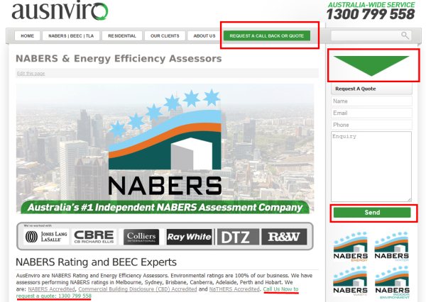
In the example above from this NABERS assessors company the calls to action are highlighted in red. They use the following techniques in order to stand out:
- A high contrast menu item
- An arrow directing attention towards the on page contact form.
- A high contrast send button, making it very clear what is expected of the user
- A call to action in the text including the phone number
Having a variety of calls to action mean that users attention is more likely to be directed towards the pages goals. Which means more leads/sales/feet-through-the-door for the company.
What Makes A Good Call To Action
Calls to action should stand out from the rest of the design. There are several ways of doing this:
- Make the Call To Action a contrasting color from the rest of the page
- Increase the empty space (white space) around the buttons or images
- Be clear on what will happen as a result of taking the action
- Use images to draw attention to the button/link
Call To Action Colours
Contrasting Colours
There are a couple of considerations to take into account when choosing a colour. Firstly, the color should contrast with other colours on the page, making it stand out. Picking a colour that contrasts whilst appearing complimentary can be selected using a colour wheel.
The Psychology Of Call To Action Colour
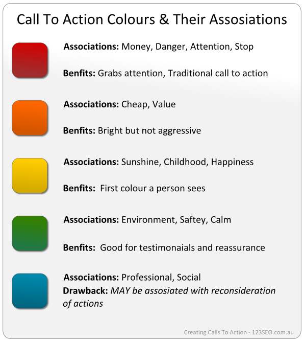
There is some to suggestion that different colours may have a variety of impacts on the CTA effectiveness. Whilst this research is a little patchy, it is worth giving some though to the associations and impact individual colours may have on your calls to action.
Red: A traditional call to action colour, red quickly grabs attention and conveys urgency.
Orange: Not as aggressive as red but still attention grabbing. Orange is a warm colour great for calls to action.
Yellow: A traditionally warm colour with positive associations. Contrasts well with blues.
Green: A safe and reassuring colour.
Blue: Associations with professional services and social media, but according to Ann Smarty, may cause users to reconsider actions.
Testing Calls To Action
Every site is different, with different challenges. No single call to action is ‘the best’. This means testing different layouts, colours and text is important for finding the most effective solution. Using event tracking and conversion monitoring in Google Analytics can help you decide which to go with.
Discussion
Putting our money where our mouth is:


